
With the news that Leeds United football club have instigated a witchhunt to see which brightspark came up with the idea for their new logo, it got us at Balls.ie thinking, where does their effort rank in the pantheon of terrible football club crests?
1. Juventus

Juventus used to have a beautiful, elegant, iconic symbol for their club, then, last year they brought out the above monstrosity. Clearly trying to come up with their own Nike/Adidas/McDonald's icon, this design is bereft of any soul.
2. Brighton & Hove Albion
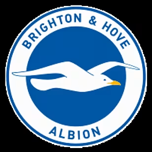
Seagull's just aren't very awe inspiring, I'm sorry.
3. Fulham
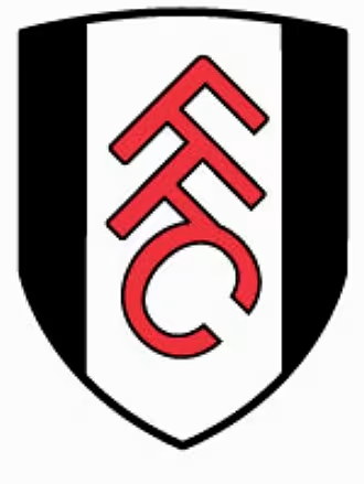
Bland. Oh so very bland.
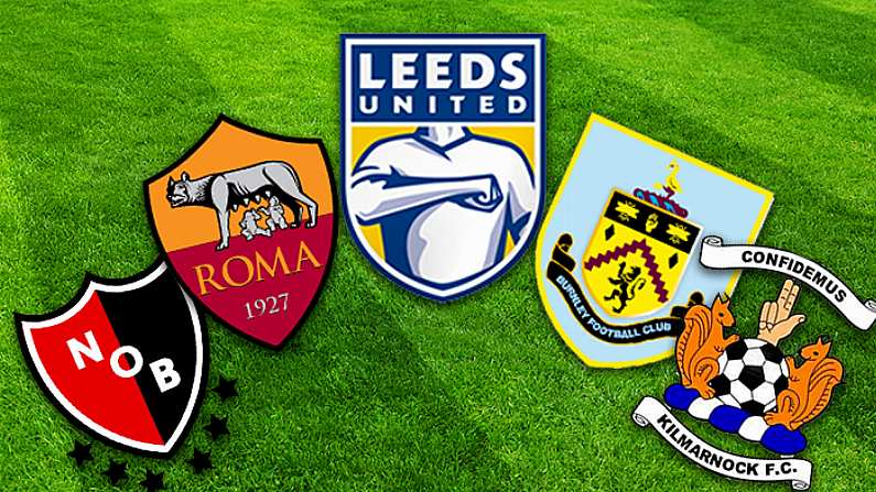
4. Burnley
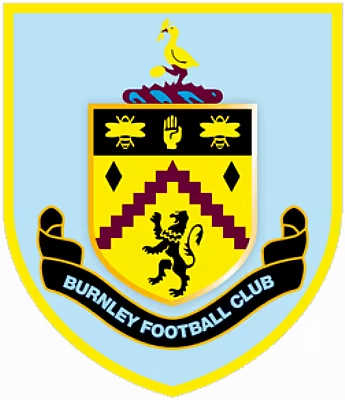
This crest is just plain ugly. The shocking yellow, the busy layout. Yuck.
5. Manchester City
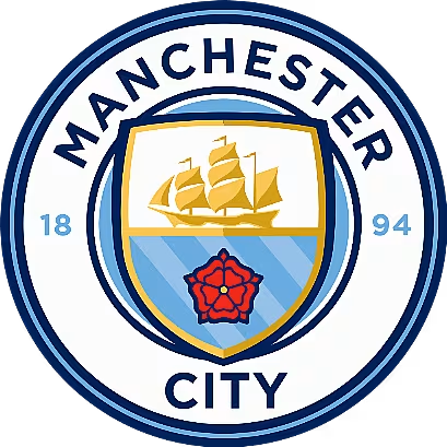
Now, this crest isn't the worst but compared to City's old one, it feels too slick. It could just as easily be a logo for a company that sells life insurance.
6. Roma
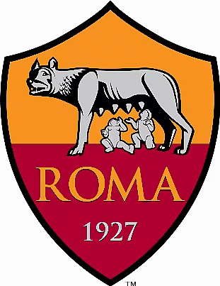
Two babies suckling on the swollen nipples of a wolf is a disturbing image whichever way you slice it.
7. Kilmarnock
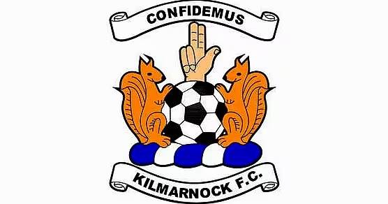
Kilmarnock, pull yourself aside and have a word with yourself.
8. Newell's Old Boys
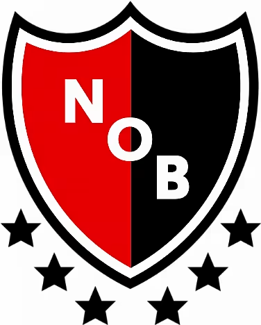
Granted Newell'd Old Boys is an Argentinian club, I can just imagine an English expat with a juvenile sense of humour suggesting this crest all those years ago.
9. Napoli

A club as iconic as Napoli deserves so much more from there crest, this effort shows nothing of the culture of the Italian side.
10. Hamburger SV
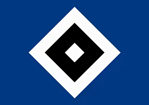
If you can replicate a crest in Microsoft Paint in under ten seconds, it's not a good design.
11. Wolverhampton Wanderers
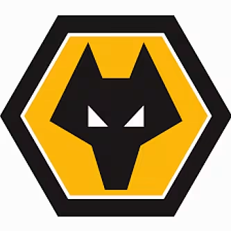
Clunky AF.
12. Gombak United
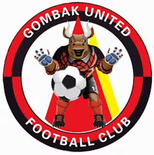
Gombak United should not have proceeded with this design, but then again the world would be a darker place without it.
13. West Ham
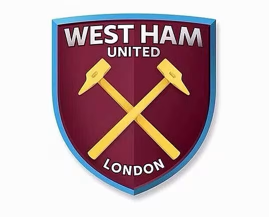
Sterile look from the Hammers, much like Man City's crest.
14. Watford
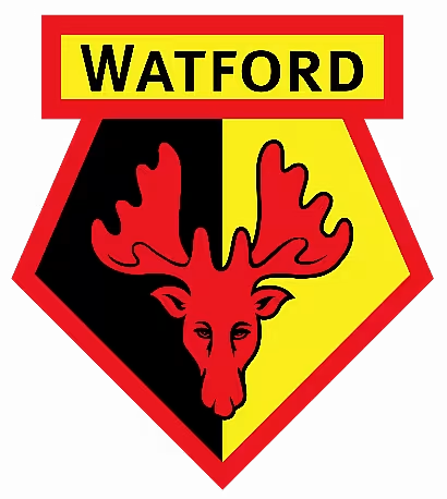
A depressed moose. Need I say more?
15. Bournemouth
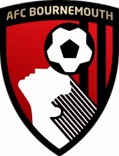
Bournemouth's crest wouldn't look out of place on a bottle of shampoo, also what's up with that ear?
16. Huddersfield Town
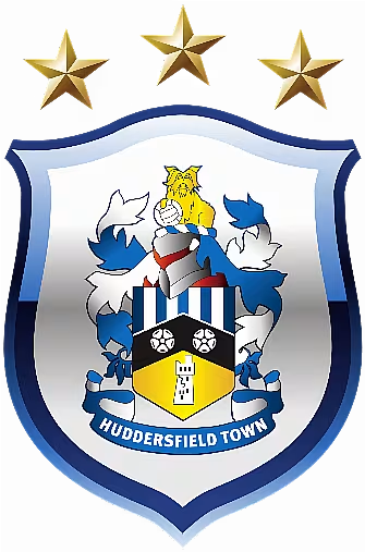
Like an old family coat of arms Huddersfield Town's crest could do with some modernisation.
17. Leeds United
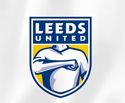
And finally the crest that launched 50,000 petition signatures. The designer must have been as headless as the logo.
See Also: Leeds United's New Crest Is An Insult To Crests Everywhere