Over the past decade or so minimalism has plagued sports team's crest redesign. Every year more and more teams are quick to get rid of their historic, detailed badges in favour of very dull designs.
From Juventus in football, Washington Commanders in the NFL to even the Crusaders in Super Rugby Pacific more teams across the globe are opting for a more minimalist design.
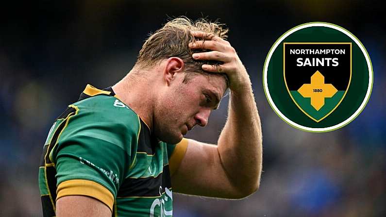
The latest team to now catch the bug is the Northampton Saints of the English Premiership. The Premiership champions posted to their social media their new rebranding, using old designs from kits in 1984 and the original crest the Saints used in 1888 as inspiration for this design
An icon rediscovered.
We are proud to reveal our new Club Crest, drawing inspiration from the first-ever emblem worn on a Saints jersey 😇https://t.co/cJVWkqbhAJ pic.twitter.com/Mm2jDQkMg2
— Northampton Saints 😇 (@SaintsRugby) July 11, 2024
And while it's good to see that they have taken elements from their past for this rebranding it's a design that has not gone down well with a lot of Northampton fans and rugby fans at large who felt that getting rid of the historic emblem for this new design isn't fitting.
This is one of the worst rebrandings I have ever seen…
I hope the same happens here that happened on the Northampton Town Football Club redesign & the last Crest is reinstated…
From iconic to… Bland… pic.twitter.com/s5AzfiPGbA
— JayCaulls (@JayCaulls) July 11, 2024
Still time to delete this guys 😂
— A View From LE2 / Elliott Butlin (@FromLe2) July 11, 2024
Possibly biggest downgrade in club crest ever seen. English Premiership rugby clubs disrespect their own history vandalising their crests like this. Northampton not the first one. Don't recall Premier League football clubs ruining their badges like this.https://t.co/RyBB9LmeqD
— Tier 2 Rugby (@T2Rugby) July 11, 2024
It even reminded some of the equally horrendous Leeds United rebrand from several years ago. Leeds did ultimately go back on their plans to rebrand and perhaps the Saints might want to as well.
This has the potential to be rugby’s version of that Leeds rebrand https://t.co/qxNHND7q8I
— CaolánSRugby (@CaolanSRugby) July 11, 2024
Many pointed out how bland the design is and that it resembles something that could be done on MS Paint as well as some mocking up their own designs for other Premiership sides.
I knew I was ahead of the curve drawing out logo on MS Paint https://t.co/6nA8aOnrNC
— Squidge Rugby (@SquidgeRugby) July 11, 2024
Diving into the trend and making a splash! Bath Rugby is ready for next season pic.twitter.com/vAxTSmbcKZ
— Linebreak Rugby 🏳️⚧️🚂✊ (@LinebreakRugby) July 11, 2024
JUST DROPPED | Bristol couldn't resist the temptation - fans fired up! pic.twitter.com/w0oLIyUUq1
— Linebreak Rugby 🏳️⚧️🚂✊ (@LinebreakRugby) July 11, 2024
It's fair to say that this rebranding has missed the mark the Saints hoped it would hit and hopefully they can go back to their classic original look or even another redesign to something that pleases more fans.


