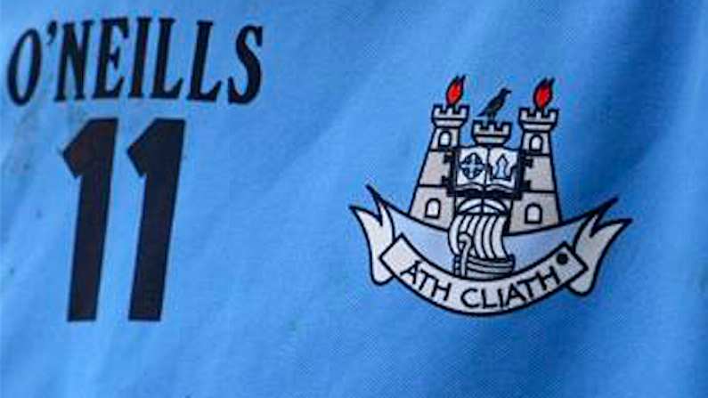
Regardless of what it actually looks like, fans across the country would always have to get used to see a lot of any new Dublin jersey. Let's be honest, we already know it's going to be on our screens more than enough this summer and Dublin fans have never been ones to hide their pride in the jersey.
But if we're all going to have to look at it so much this summer, it's good of O'Neills to make sure it's as nice as possible.
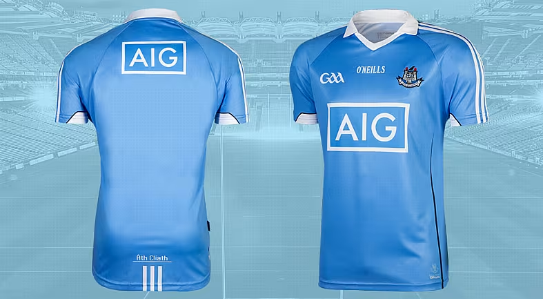
The new jersey was released via sponsors AIG this morning and the press release goes into detail with 'the spire-like lines running down the waste' promising quite a bit of detail.
The new design sees some softer elements come into the design with elegant touches throughout such as the spire-like lines running down the waist and the white striped shoulders. The collar sees a contrast from previous kits boldly boasting a fine white colour pallet instead of navy.
The back of the kit features a charming inclusion of Gaelic with the words "Áth Cliath" embroidered above 3 shortened stripes. As proud insurers of Dublin GAA, AIG messaging is visible on both the front, centred below the Dublin crest, and on back of the kit, just above the shoulders. The underarms feature white detailing which gives a fresh modern edge to a classic design.
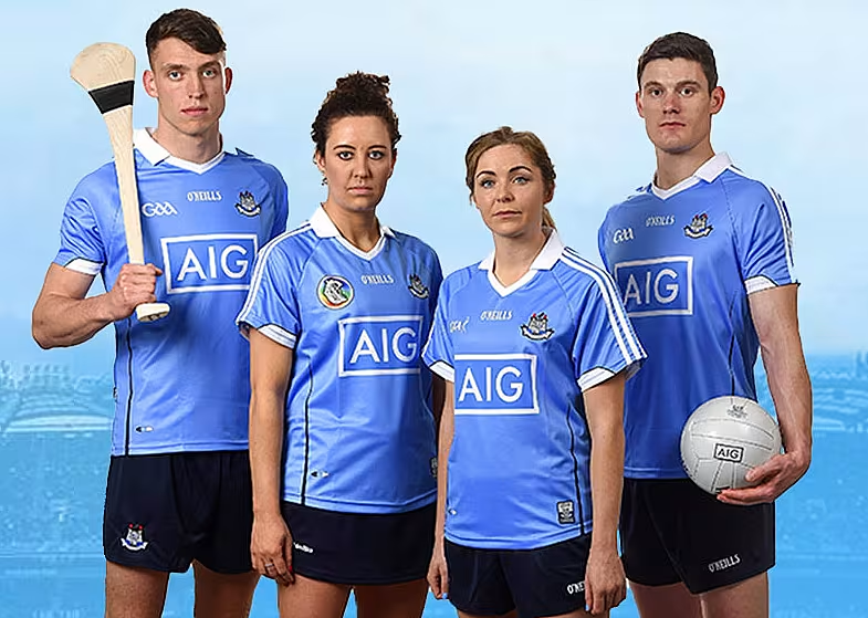
#DrawnFromHistory pic.twitter.com/MG4pWZoRxS
— Dublin GAA (@DubGAAOfficial) May 12, 2016
Bernard Brogan, who's knows a thing or two about fashion judging by his rather sartorial profile picture, is giving it the thumbs up and we can't say he's incorrect. Noice indeed.
New Jersey, Noice!!! #COYBIB pic.twitter.com/XB9jiqvSr7
— Bernard Brogan (@bernardbrogan) May 12, 2016

