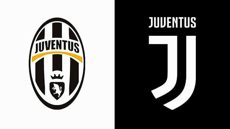
The latest "what have you done" moment caused by a decision at a football club made by somebody who seemingly has absolutely no idea what a football club is about is the totally unnecessary rebranding of Juventus.
The iconic and instantly recognisable Juve logo, which was deemed not marketable enough internationally, has been ditched in favour of what is literally two types of the letter 'J' spooning like a logo for a pretentious dating app.
The logo was unveiled earlier today to what we can only assume was gasps of horror.
Agnelli: "This new logo is a symbol of the Juventus way of living." #2beJUVENTUS pic.twitter.com/x5B3fapqGJ
— JuventusFC (@juventusfcen) January 16, 2017
Initially we were not sure if this was actually a new logo for the team to wear on jerseys and team gear, or just some line of casual clothes or whatever, but it really does appear to be a new club logo.
Here's the Balls.ie version, which took precisely four seconds and actually doesn't look that bad because we're a website and not a football club that was founded in 1897.

The unveiling went down like a lead balloon and social media was lit up by puzzled football fans mourning the death of one of the best club logos around, and taking the piss out of the new one.
What the fuck have you done @juventusfcen
— Jordan (@Jorc94) January 16, 2017
@juventusfcen pic.twitter.com/R3rbDd7NHv
— Kristian (@SFC_Kristian) January 16, 2017
Just knocked up #ACMilan's new badge for next season... that'll be €3m please? #Juventus #AwfulLogo #SerieA pic.twitter.com/jQzSfImuMR
— Kevin Pogorzelski (@RabbitRabbitOn) January 16, 2017
Juventus designed that logo in MS Paint
— Zito (@_Zeets) January 16, 2017
Loving Juventus new logo, it symbolises all their CL finals since 2003 pic.twitter.com/J5pnOOkWh3
— Milan Bangers (@acmilan_sa) January 16, 2017
It certainly does seem like a strange decision. Was the old logo really that outdated?
And what sort of difference is this going to make in the international market? Granted people are paid good money to be experts on this sort of stuff, but this appears to be the least popular logo unveiling since Everton, and the backlash was so vicious in that case that the club had to change the logo again.

