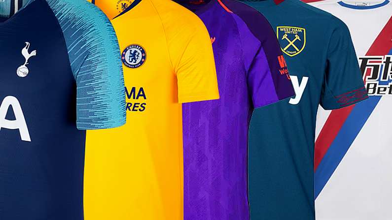
Okay so we've already taken a look at all of the home jerseys for the 2018/19 Premier League campaign, so it is only natural that we rank every PL team's away kit for the upcoming season. While the majority of away Premier League kits have been released Burnley are still holding out on us, but alas we must carry on.
Ranking All The Away Premier League Kits For 2018/19
19. Liverpool
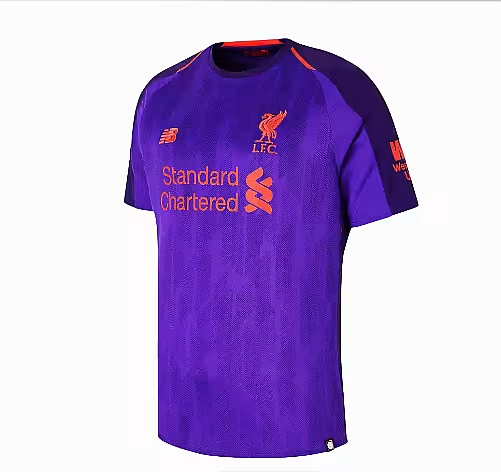
Liverpool have a history of terrible away kits and this one is no exception. Truly godawful.
18. Manchester United
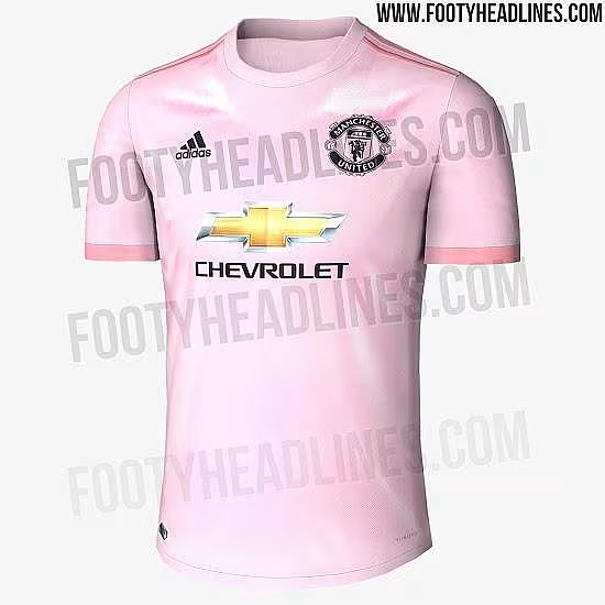
This is the rumoured second kit for United, and the cotton candy pink really doesn't do it any favours. Icky.
17. Cardiff City
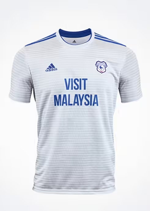
'Visit Malaysia' is enough to see this uninspiring effort to 17th spot.
16. Southampton
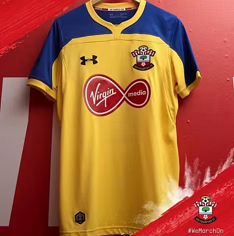
Meh. Too much going on with the blue, yellow and red.
15. Arsenal
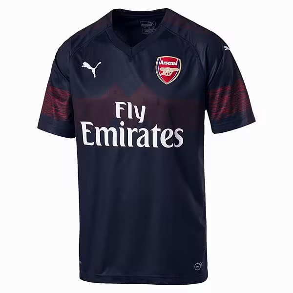
A bit confused from Puma here, don't really know why there is a weird pattern on the sleeve and the 'M' band across the chest.
14. Everton
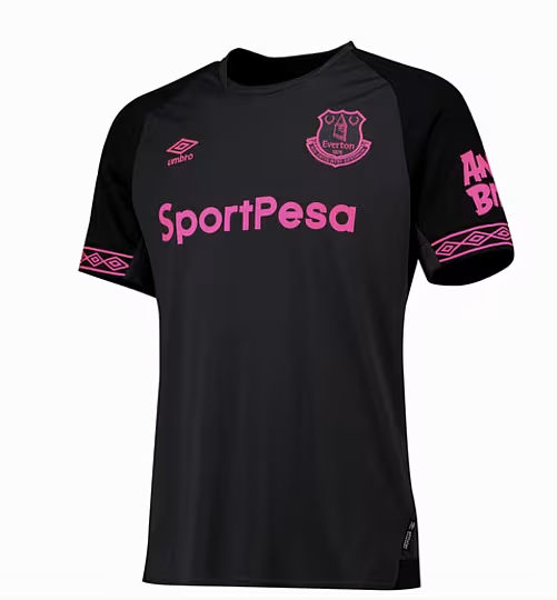
The pink just does not work.
13. Manchester City
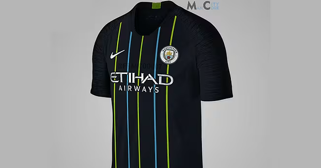
Don't know what Nike were thinking here with the green and blue on the black, very jarring.
12. Brighton
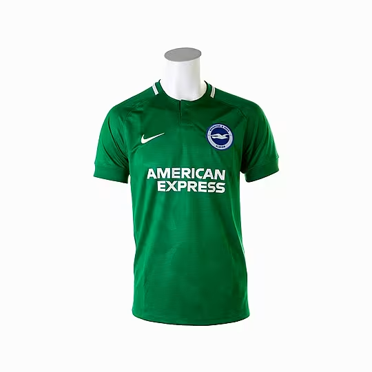
The faint pattern against the green lifts this kit above the ordinary.
11. Huddersfield Town
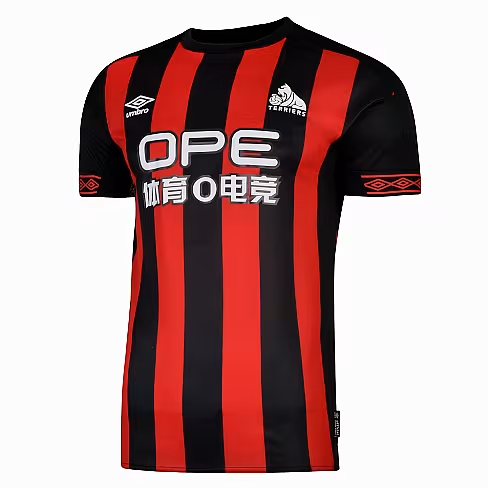
Huddersfield Town's second strip looks very like Bournemouth's home one, with the Umbro logos on the sleeve trim the only discernable difference.
10. Chelsea
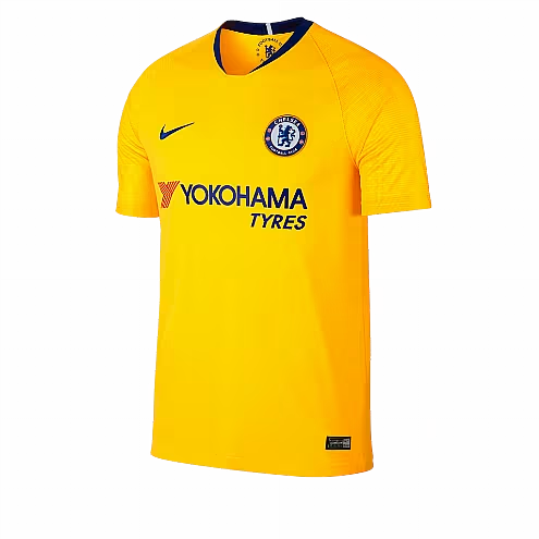
I'm not a massive fan of yellow kits, but Chelsea's effort is fairly inoffensive.
9. Wolverhampton Wanderers

Nothing much to write home about. Horrible sponsor as well.
8. Fulham
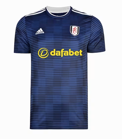
Fulham's away kit is grand, I have no strong feelings either way.
7. Leicester
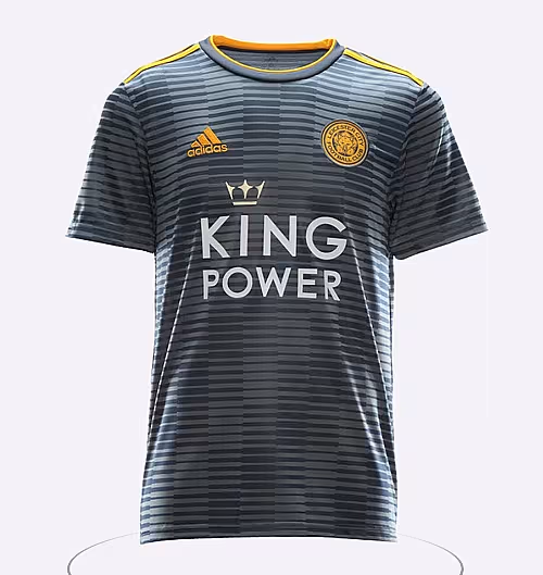
Leicester's is just a mirror of Fulham's kit, so the same sentiment applies.
6. Watford
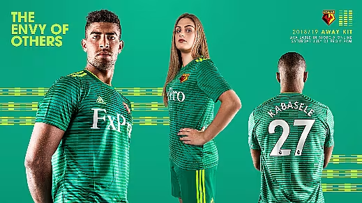
Watford have gone green for this season, keeping the same design as Leicester and Fulham.
5. Bournemouth
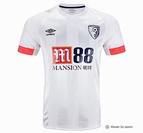
Looks like an old Tottenham top, even has the same sponsor. At least the sponsor ties in with the red Umbro sleeves though.
4.West Ham
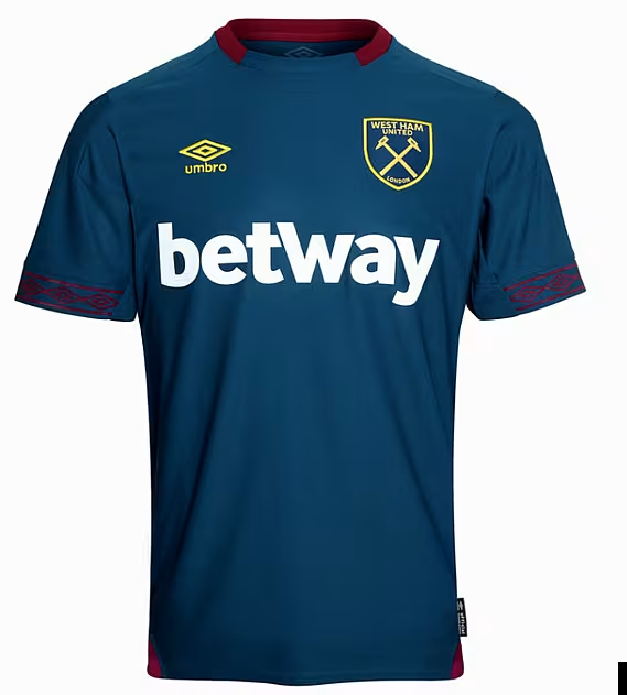
Big fan of the colour scheme here. I know it's not the most complicated design, but gosh darn it I just think it looks swell.
3. Newcastle

Newcastle and Puma have taken inspiration from Newcastle's old 1995-96 Adidas away kit and the maroon and navy looks great. The impact of the sponsor is also lessened with the gold lettering. Two thumbs up.
2. Crystal Palace
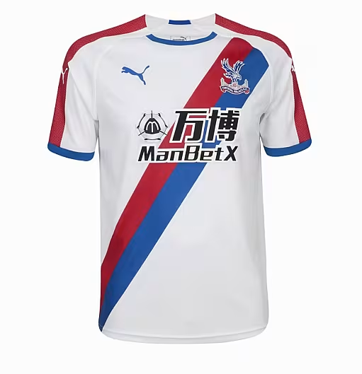
Both Crystal Palace's home and away kits are absolutely gorgeous, and their second strip is well worthy of 2nd spot. You don't see enough sashes on kits, and this one works beautifully. Bravo.
1. Tottenham Hotspur
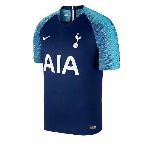
Lovely stuff. Tottenham's away kit is very reminiscent of France's home jersey, which is all good with me because it looks the biz. Whatever you call that shoulder pattern is all the rage with Nike kits at the moment, with the different shades of blue working particularly well.

