

As the 2025 League of Ireland season gets underway, we're taking a journey around the country to examine the primary symbol of each of the 20 teams: the club crest.
Starting in our capital city, three LOI teams have the iconic Dublin castles on their crest (whether or not they are, in fact, castles is up for debate – some say they are watchtowers or possibly gates).
Bohemians
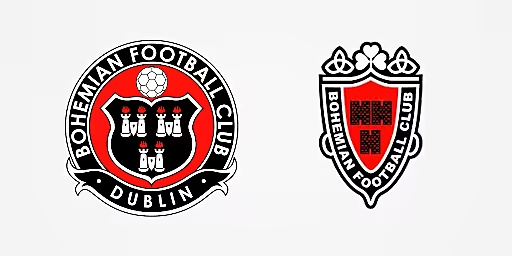
The current Bohs crest (left) and the previous version used in the late 1990s and early 2000s.
First introduced in 2006, Bohs’ current circular badge is quite different from what came before. The castles are still prevalent but in previous iterations they were contained within a uniquely narrow shield with a shamrock sitting on top. Perhaps the newer shamrock-less version is more appropriate given the club’s bitter rivalry with Shamrock Rovers, although they did revert to the old design for their 2022 home shirt.
UCD
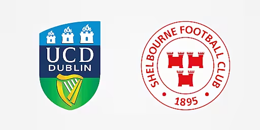
The Students of UCD use the college’s logo, which is also adorned by the three castles, as is the emblem of reigning Premier Division champions Shelbourne. This season the Shels crest has a special ‘1895-2025’ inscription to mark the club’s 130th anniversary.
St. Patrick's Athletic
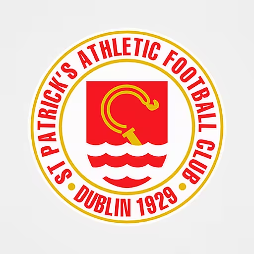
Staying in Dublin, the crest of St Patrick’s Athletic, which in this writer’s opinion is one of the best-designed logos of the bunch, includes the golden crozier of St Patrick emerging from the waves of the River Camac.
Shamrock Rovers
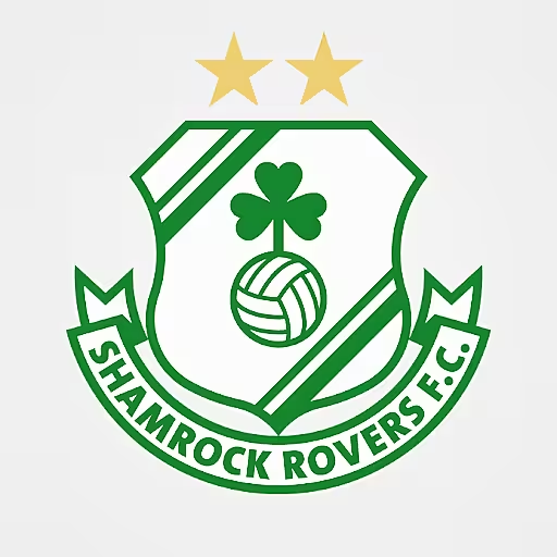
There’s nothing too mysterious about the badge used by the league’s most successful side, Shamrock Rovers. Incidentally, the name of the club derives from Shamrock Avenue in Ringsend where the first club rooms were located. The crest is adorned by two gold stars which together recognise the club winning 20 league titles. They now have 21 for anyone who’s counting, and we’re sure Rovers fans are.
Bray Wanderers
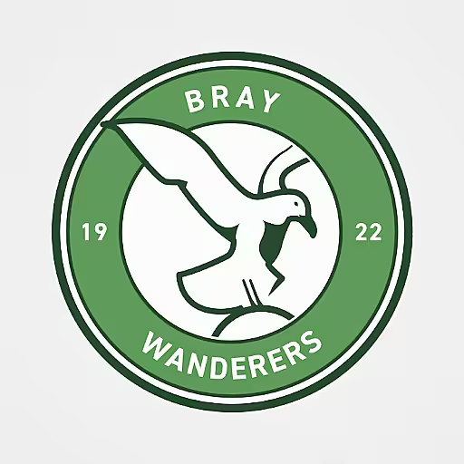
Heading south from Dublin, Bray Wanderers unveiled a new, simplified crest in 2023. Comparisons were immediately drawn with the Bristol City design but, in fairness, the rebrand is in line with the global football trend of adopting circular badges, many of which bear some similarities with each other.
Wexford FC
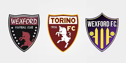
The old Wexford crest (left) was inspired by Torino (centre). On the right is the new design unveiled in 2022.
Wexford FC launched a new visual identity in 2022, moving to the purple and gold colour scheme familiar to fans of the GAA, and releasing a new crest in the process. The updated badge features three pikes, a nod to the 1798 rebellion, which together form a stylised ‘W’.
The previous crest was inspired by the logo of Torino. Wexford Youths founder Mick Wallace is a season ticket holder at the Italian club.
Waterford FC
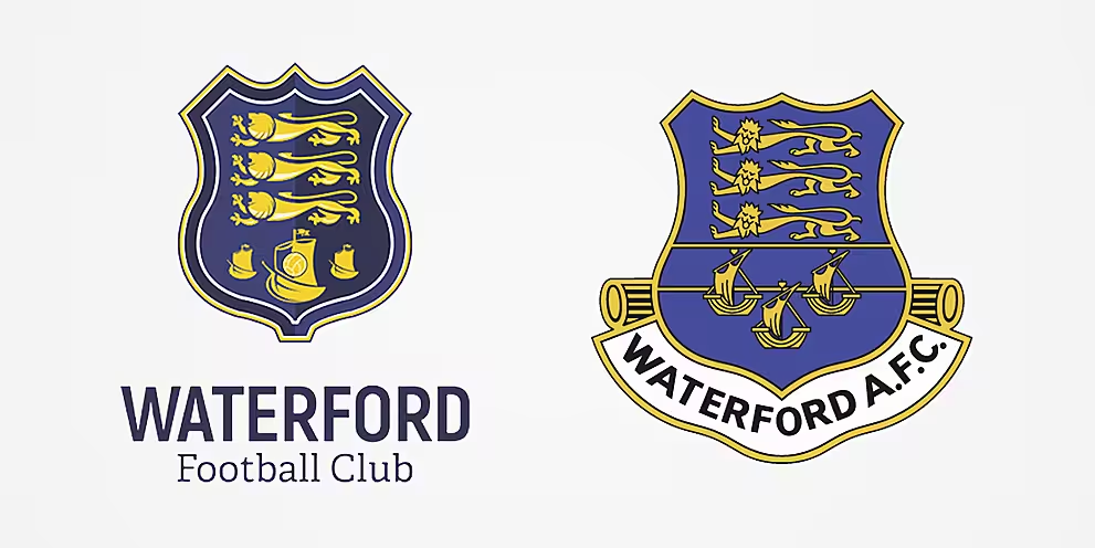
Waterford's three lions are taken from a historic Waterford AFC crest.
Waterford’s current design was commissioned as part of the club’s decision to switch from ‘Waterford United’ back to just ‘Waterford’ ahead of the 2017 season. The new badge received some negative feedback for its England-esque three lions, but it’s actually a callback to a Waterford AFC crest of the past, which itself was influenced by the old Waterford coat of arms.
Cork City
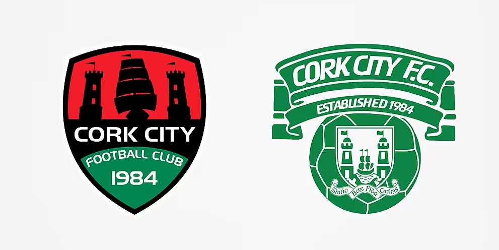
Above you'll see the existing Cork City crest (left) and the classic version used between 1986 and 1999 (right).
Down in what the locals call ‘the real capital’, Cork City’s current crest was created in 2010. The image of the ship sailing between two castles is inspired by the Cork coat of arms, which itself refers to two castles that guarded the eastern side of the city in Norman times. The motto of the city, which appears on the Cork coat of arms and also the iconic Cork City crest that was used between 1986 and 1999, is 'Statio Bene Fide Carinis' which means ‘a safe harbour for ships'.
Cobh Ramblers
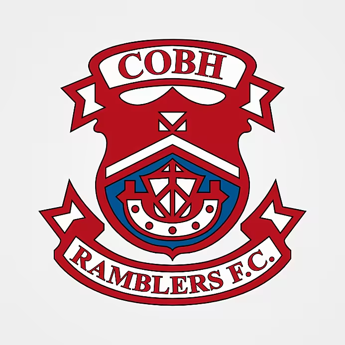
The Cobh Ramblers badge borrows from the Cobh coat of arms with its ship of war beneath a chevron, all in the club’s colours of claret and blue which were inspired by Burnley, the winners of the English First Division the year before Ramblers were founded in 1922.
Kerry FC
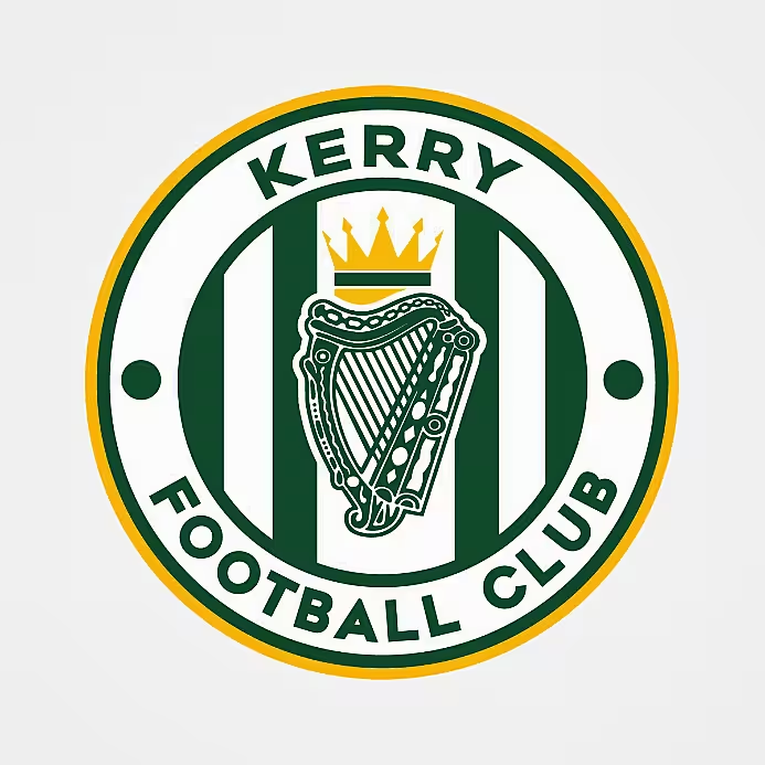
Over the border in Kerry, the league’s newest club entered the First Division in 2023 sporting a modern round crest that features a crown resting upon a harp. The crown also appears on the Kerry coat of arms and is said to represent the Ciarraige, the pre-Gaelic people from whom the county gets its name.
Treaty United
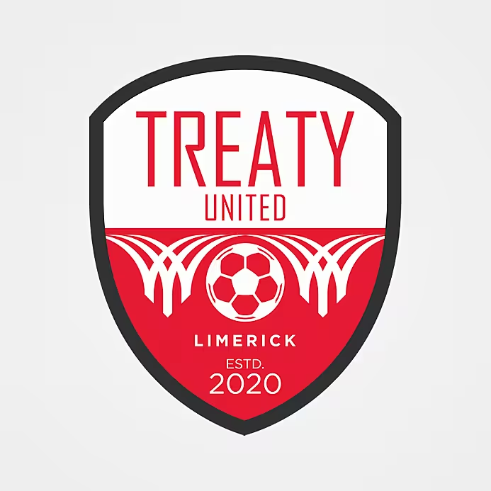
On we go, up the west coast to Limerick where the arches in the Treaty United crest represent the three bridges around the city that cross the River Shannon. Interestingly, the club changed the colour of their home shirts from red to blue in 2024 but the crest is still red and white, acknowledging the fact that the first ever senior club that represented Limerick in the League of Ireland played in those colours.
Galway United
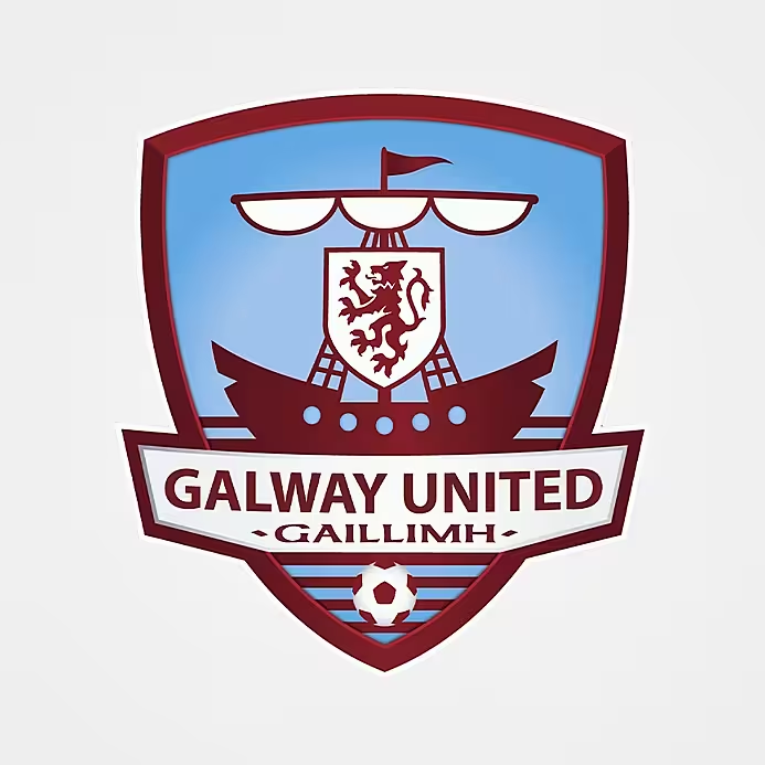
Galway United’s badge is comprised of a ship on the water and a rampant lion within a shield. They are the only LOI club with an Irish word on their crest (‘Gaillimh’).
Athlone Town
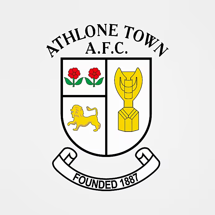
Athlone Town boast one of the most interesting and unique crests in the league. The two roses and the lion on the left half of the badge are taken from the Athlone coat of arms. On the right-hand-side stands the Jules Rimet trophy, awarded to the winners of the World Cup from 1930 to 1970. Brazil’s victory in Mexico in ‘70 marked their third World Cup triumph and as a result the trophy, named after the former FIFA president, was considered theirs to keep.
Pele with the Jules Rimet trophy pic.twitter.com/xmrlsjoAFl
— The League Magazine (@Theleaguemag) June 18, 2024
Writing in his blog ‘ninetyplusfour’, LOI aficionado John G. O’Sullivan reveals that when Athlone Town were devising their logo in 1970, they were inspired by the crests of Athlone GAA and Athlone Golf Club, both of which included the roses and lion on the left. But rather than including a local landmark in the space on the right as the other clubs did, they opted for a soccer symbol instead.
“The original crest was designed by Séamus O’Brien (of The Man’s Shop) among others for the 1970/71 season,” Athlone fan Peter Keenan told John. “The Jules Rimet trophy was used intentionally after the hype of the World Cup in Mexico in 1970.”
Longford Town
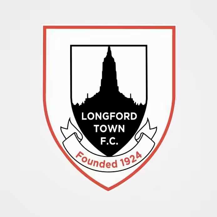
Moving slightly north, the crest of Longford Town contains a silhouette of St Mel’s Cathedral. The consummate LOI website Between The Stripes informs us that the club was founded in the Longford Temperance Hall, which sits right across the road from the cathedral, which is how it ended up the club's crest.
Sligo Rovers
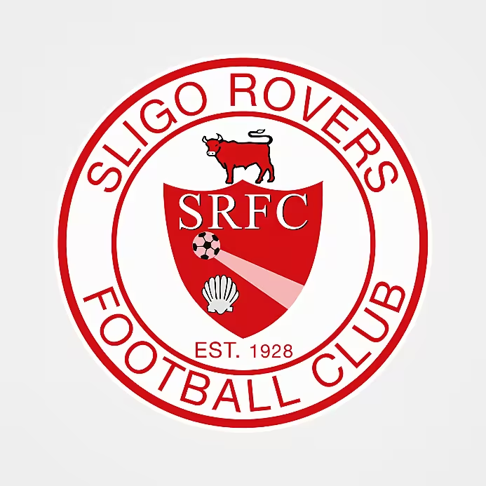
Sligo Rovers’ design includes a bull (possibly a reference to the story of Queen Maeve and the Brown Bull of Cooley – Maeve is said to be buried in Sligo) and a shell. The Irish for Sligo, ‘Sligeach’, means ‘shelly place’.
Finn Harps
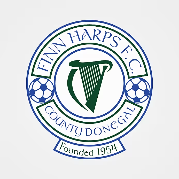
Up in the northwest, Finn Harps have a simple and self-explanatory badge based on the club’s distinctive name which they adopted at their foundation in 1954. The harp is, of course, a traditional symbol of Ireland and ‘Finn’ is a reference to the River Finn which flows through Harps’ hometown, Ballybofey. The badge also includes the inscription ‘County Donegal’, added in the 21st century to reflect their status as the county’s senior football team.
Derry City
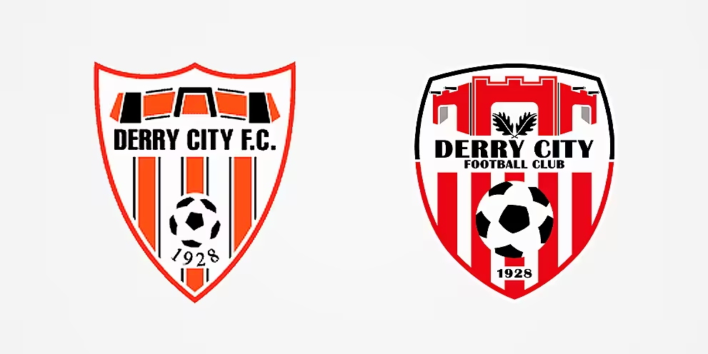
The Derry City badge designed by a schoolboy in 1986 (left) and the current iteration (right).z
Up until 1986, Derry City used the city’s coat of arms as their crest, an emblem which features a skeleton that is thought to represent a Norman de Burca knight who was starved to death in the castle dungeons in 1332.
In 1986, John Devlin, a fourth-year student at St Columb's College, won a competition to redesign the club’s logo. His striking crest depicted a simplified version of the Foyle Bridge, along with the club’s traditional ‘candystripes’, and a football in the centre.
The current version, which has been in use since 1997, retains the stripes but the bridge is replaced by red armaments with black cannons, representing Derry’s historic walls that protect the town centre. The crest also includes oak leaves. The Irish for Derry is ‘Doire’ which translates as ‘oak grove’.
Dundalk
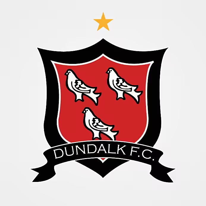
Crossing back over to the east coast, Dundalk’s logo is made up of three martlets on a shield, a symbol they borrowed from the Dundalk coat of arms in 1927. The martlet is a mythical bird with no feet – on paper not the best mascot for a football team – but as they are constantly flying they are said to represent continuous effort, which is perhaps more fitting.
In a similar vein to Shamrock Rovers, the Dundalk crest has a gold star to signify the fact they have won 10 league titles. In fact, they have now won 14, so they only need six more to earn star number two.
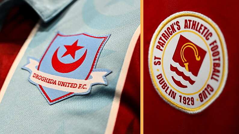
Drogheda United
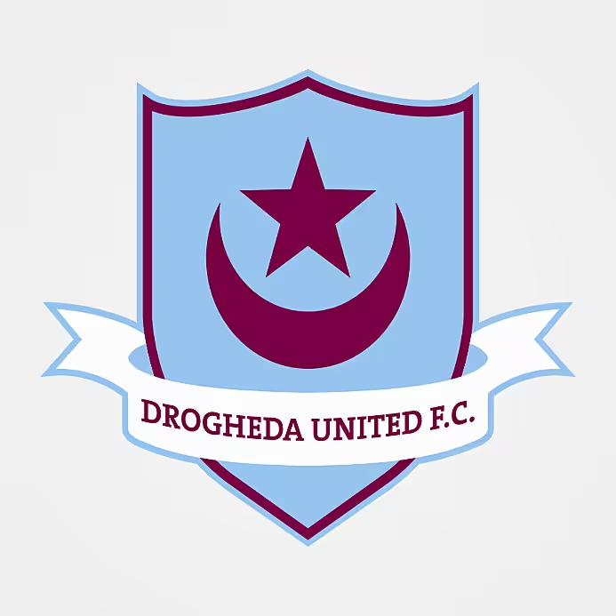
Finally, Dundalk’s Louth neighbours Drogheda United have an intriguing design that has led to an unlikely alliance with another club almost 3,000 miles away.
The Drogheda logo features the star and crescent symbol most commonly associated with Islam. It can be found on several national flags, including those of Turkey, Libya, Malaysia, Tunisia, Pakistan and others. In fact, some believe the link between Drogheda’s star and crescent and Turkey’s star and crescent is a direct one.
According to legend, an Irish physician in service to the Ottoman Sultan in Istanbul asked for aid to be sent home to Ireland during the Great Famine. Sultan Abdülmedjid sent £1,000 to Ireland (he had planned to send much more but Queen Victoria, who only sent £2,000, insisted that he send less than she did) and he also secretly dispatched a number of ships to deliver grain to the port of Drogheda. The town then added Turkey’s star and crescent to their crest as a sign of gratitude.
It’s a good story, and Turkey did send aid to Ireland during the famine, but sadly the last part doesn’t appear to stack up. The star and crescent has actually been on the Drogheda coat of arms since the late 12th century, bestowed to the town by the English king Richard the Lionheart, and United’s crest is based on this emblem.
While there might not be any meaningful connection between Drogheda United’s star and crescent and Turkey’s star and crescent, the use of the symbol has led to a meaningful friendship between the Louth outfit and Turkish club Trabzonspor.
Apparently attracted to the Drogs because of their “Turkish” symbol and identical club colours (claret and blue), Trabzonspor fans sent donations when Drogheda were experiencing financial difficulties in 2008.
"They were tremendous at the time,” former Drogheda PRO Róisín Phillips told the RTÉ Soccer Podcast in 2020. “They were publicising us in Turkey, they were setting up Facebook pages, they were sending donations in envelopes from Turkey. I remember getting an envelope one day and €40 fell out of it.
"There were several people in particular, staunch fans, who just couldn't do enough for us.”
The two became sister clubs in 2011 and the bond remains strong to this day.
In 2023, almost 180 years on from the Irish famine and the Sultan’s donation, Drogheda United collected supplies from the local community and sent aid to Turkey in the wake of a devastating earthquake.
Formlarımızda kardeş kulübümüz Trabzonspor’un da sloganı olan #yanyana’yı kullanmaktan gurur duyarız.@Trabzonspor | @TurkishAirlines
🟣🔵 #OurTownOurClub pic.twitter.com/WP3g3YxZXd— Drogheda United F.C. (@DroghedaUnited) February 6, 2023
When Drogheda won the FAI Cup in 2024, Trabzonspor were quick to offer their congratulations on Twitter. “We are proud of you,” the Süper Lig club wrote. Drogheda thanked them and noted that several Trabzonspor fans made the long journey to attend the final and cheer on their adopted Irish team.
And all this goodwill blossomed from simple things like shared club colours and that star and crescent crest.
That completes our tour of League of Ireland crests. Which design is your favourite?

