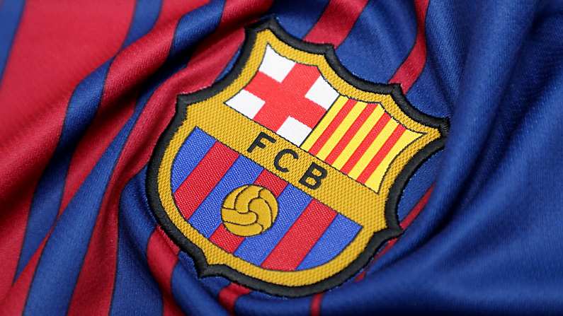
The Barcelona emblem is one of the most iconic in football. It is a simple design that doesn't really need to be improved upon, though this hasn't stopped the Catalan club from trying.
The La Liga side have released a video showing the evolution of the crest through the years alongside the latest change, which is so miniscule you'd wonder why it even needs member approval:
This is the proposed update to the Barça crest, subject to member approval
?? pic.twitter.com/csIHvX2ZyS— FC Barcelona (@FCBarcelona) September 27, 2018
No danger of a Leeds-esque style fan revolt here. All they've done is lose the 'FCB'.
Here is there immensely waffley explanation for the update:
FC Barcelona is changing its crest in order to adapt to modern times. Since the design was last updated in 2002, the context, society and technology have changed enormously, and the symbols identified with the club need to evolve too.
This evolution stays faithful to the historical elements of the crest: the city, Barcelona; the country, Catalonia; the club, the 'blaugrana' colours; and the ball. But the new design now has greater reproduction capacity, especially in the increasingly more important world of digital media. The most striking changes are an increase in the balance and impact of the team colours, the greater presence of a central and iconic element of the Barça style of play, namely the ball, the homogenisation of the forms and colours, and the disappearance of the FCB acronym.


